Portelo
Portelo is a platform for B2B companies to more easily manage projects.
My Role: UI/UX consultant
Tools and Languages: Adobe CC (Photoshop, Illustrator), Figma, HTML, CSS, JavaScript, Vue.js, ChatGPT
Team: Me and the CEO
Challenge: Too Much Info with Equal Weight
The existing project management interface displayed too much information with equal weight, making it difficult for managers to identify a project's basic parts.
Process: Design by Emphasis
Identify 3 key points for more attention
- Who is the client?
- What is the status of the project?
- What is the budget?
Outcome: Implement the solutions identified
Identify 3 key points for more attention
- Display partner logos.
- Creating progress bar.
- Showing the money.
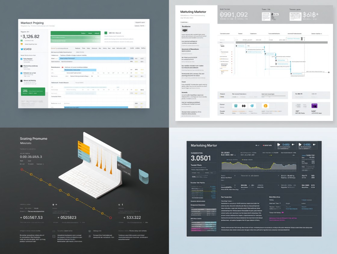
Old List vs. New Grid View
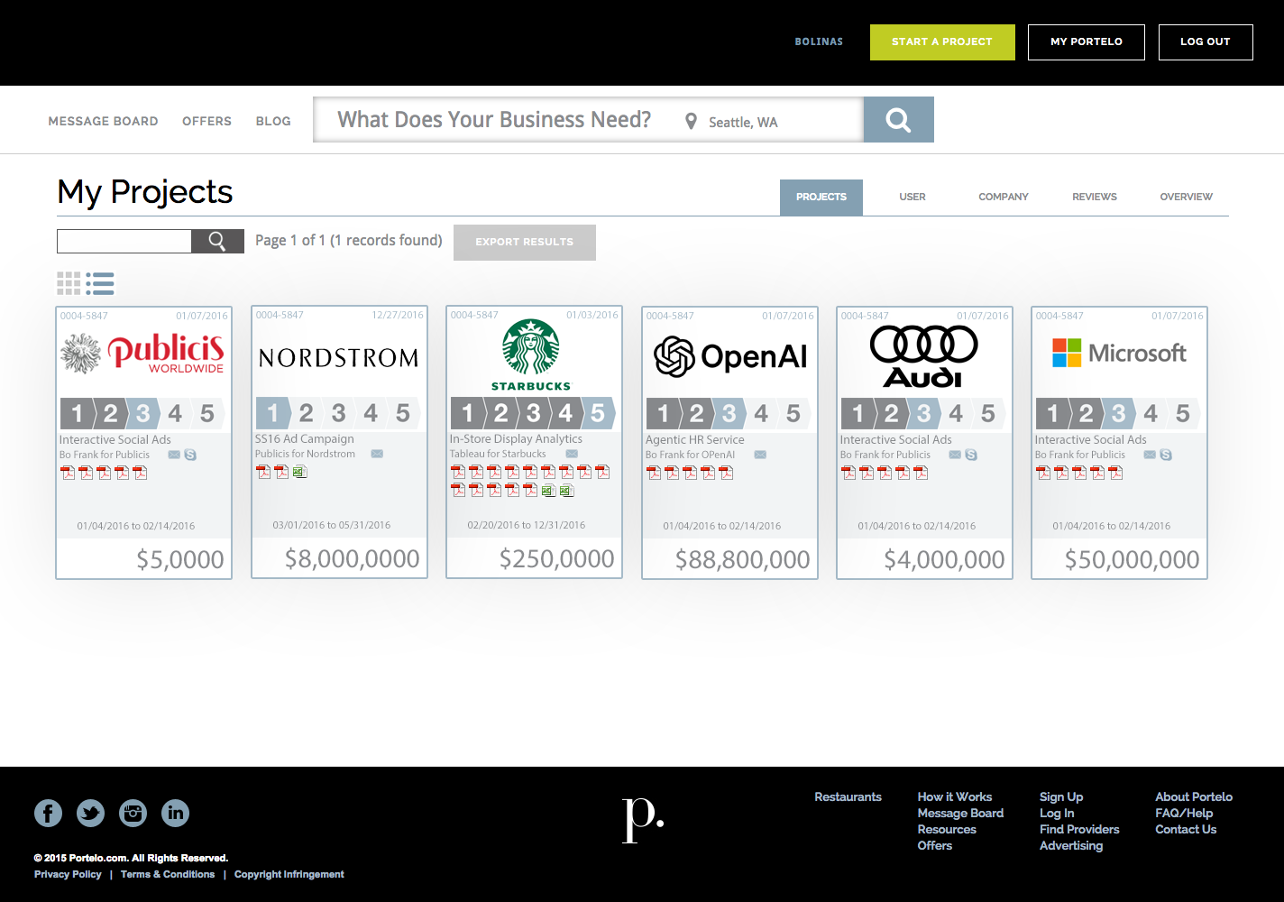
Old List View
The old existing view looked like a slight upgrade to a default Excel spreadsheet. Although this view has all the information, everything is basically equal weight visually requiring more work for the viewer to figure out the key parts of any project.
-
The old view required the viewer to click on the Project ID to find out which company the project was with.
-
Another key point of any project identified was the status of the project. The managers needed to know where they were at in regard to the progress of the project. The old existing view showed the date details of when things started and when they were due, requiring the manager to figure out status by referring to calendar dates.
- One of the most critical parts of any project is how much money is involved. The old view did show this, but really did not reflect the importance of this most crucial element.
New Grid View
What are the key parts of any project that a manager needs to know? I emphasized those parts making the project listing easier to understand. The following looks at each project element and how I made improvements based on those questions asked.
-
The new view clearly shows the company logo, since that gives an immediate brand recognition letting the viewer know who the project is for at a glance.
-
I added a progress bar that pulled data from an external shared project board containing to-do items and simply displayed a calculated progress bar giving the manager the status of any project with quick glance.
- I made the budget the most emphasized element underlining any project. This number is the one thing everyone wants to know. Managers could now immediately know where to focus their attention.
When clicking on a card, the detail view of that project appears.
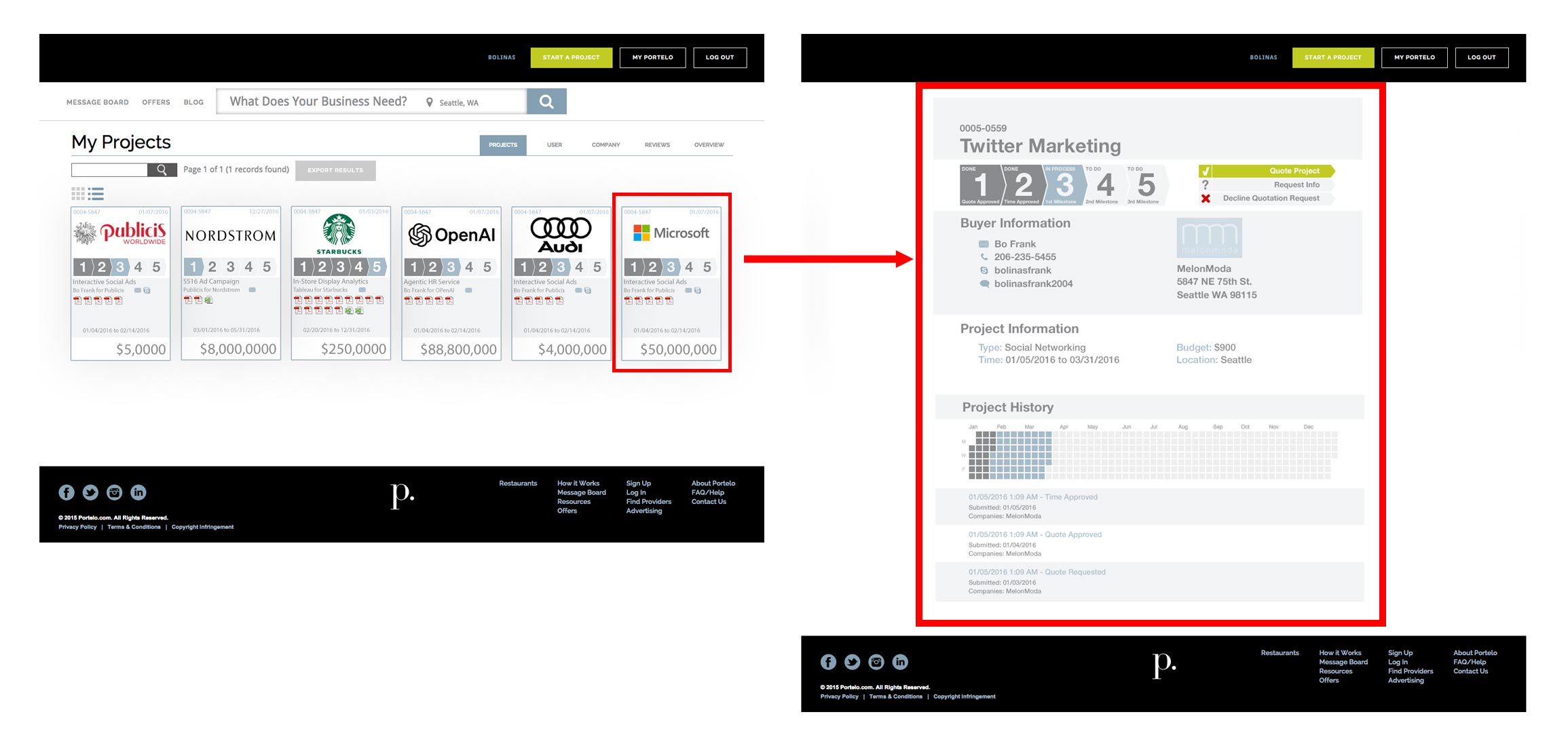
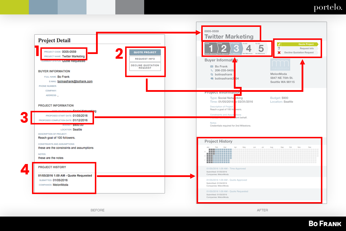
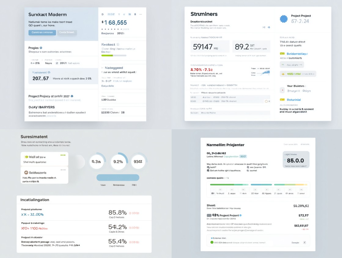
Old and New Project Detail Comparison
This is the before and after comparison of how those Project Detail detail cards were improved.
-
The project name is clearly shown at the top.
-
The call to action is enhanced with the color theme and icons.
-
The status of the project is clearly shown in a more descriptive progress bar.
-
The history of the project can clearly be seen in the calendar grid.
Impact and Results
82%
Improved Usability Perception
% of managers who report improved clarity of project status after UI update
Why it matters: Measures how effective the progress bar and redesigned grid/card view are at quickly communicating project health.
- Before redesign: 45% satisfaction with project status visibility
- After redesign: 82% satisfaction
92%
User Engagement with Project Grid
Average interactions per project card (clicks, hovers, CTA clicks)
Why it matters: Shows whether the game-inspired design (progression, rewards, visual hierarchy) increases engagement.
- Previous list view: 1.3 interactions per project
- New card view: 3.8 interactions per project
76%
Next Stage Project Conversion
% of projects moving forward after user clicks the “Next Action” CTA
Why it matters: Measures how effective the redesigned detail screen is at guiding managers to complete actions.
- Before redesign: 54% of projects progressed within 3 days
- After redesign: 76% of projects progressed within 3 days
Can AI further this project?
The following are three concise ideas focusing on how AI can further this platform’s impact.
1. Intelligent Project Insights + Forecasting
AI can analyze historical project data with budgets, timelines, and status updates to automatically forecast risks, potential delays, or budget overruns. For example, a ML model could flag projects likely to miss deadlines based on past performance patterns, giving managers proactive alerts instead of reactive reports.
Suggested AI Tool: Forecast.app
2. Natural-Language Interaction + Summaries
Integrating an AI assistant (like ChatGPT or a Copilot agent) would allow managers to query the platform in plain language. For example “Show me projects at risk this quarter” and receive instant, conversational answers. Automatic daily summaries could highlight key changes (“Project X is 80% complete, budget utilization at 92%”) without requiring users to dig through dashboards.
Suggested AI Tool: OpenAI GPT API
3. Smart Prioritization + Personalized Views
AI-driven personalization could dynamically re-order or visually emphasize projects based on each manager’s role, urgency, and past behavior. For example, a sales lead might see high-budget deals first, while an operations manager sees projects nearing deadlines, with the UI adjusting in real time.
Suggested AI Tool: Any Personalizer (Metarank, PredictionIO, Rexy)